In today's lesson, we experimented with a different kind of photographic medium which fell more into the sub-topic of presenting photos rather than actually taking them. The first thing we did was print off photos onto regular paper, I decided to print off photos that I had taken as well as those from other artists so that I could get a variety of different outcomes. Then we placed the picture inside of an empty teamed and dipped it in hot, liquid wax. After taking the photo and tea-bag out of the wax and leaving it for about a minute or so, the wax had cooled and hardened around the teabag forming a sort of protective sheath to the picture. The process was essentially quite similar to that of lamination but I think it gave the photos a lot more character.
After using teabags we decided to experiment with other materials like tissue paper, silt, muslin, and regular paper, as well as trying out writing on the photos and paper before dipping them in the wax. Each material had a slightly different finish to them, the silk was quite thick but smooth where as the tissue paper was thin and created a more crumpled look due to how difficult it was to keep it flat while in the wax and drying.
Experimenting with these materials was really insightful and enjoyable, it had the ability of transforming a regular photo into something with personality and I think I will consider incorporation it into my final piece.
Here are some of my finished pieces:
Wednesday, 11 February 2015

John Rankin
RANKIN is a photographer who covers many different sections of the art. Celebrities, fashion and more. He also has a wide portfolio of beauty shots. This is not solely peoples faces alone but instead focusing on make-up as an art. the photo to the right is one of my favourite of his and of all beauty shots; it is very clean and sharp. There is a good contrast between the blacks and whites, the intense whiteness brings out the shadows making the photograph seem even more dramatic. The blue make-up to the sides affects the face in a way that accentuates the blue of the subjects eyes, creating an even more piercing look. I don't think there is supposed to be a strong, overpowering message in this picture- beauty shots don't usually have one, they're simply beauty shots- however if you were looking deeply enough to intentionally find one, it's as if the black around her eyes is coming from within and seeping out, like her darker side is coming out as it so rarely does but when it does: it's hard to miss.
The photo itself is quite compelling in a way. I think that this feeling comes from not only the subject but also the composition and lighting. The subject has been positioned slap bang in the centre which in still life or landscape photography could be considered a flaw, but in portraiture like this it can really help make an impact. The image is very distinct, the stark white lighting makes every feature of the photo stand out making it even stronger.
~~~~~~~~~~~~~~~~~~~~~~~~~~~~~~~~~~~~~~~~~~~~~~~~~~~~~~~~~~~~~~~~~~~~~~~~
 The black background in this photograph helps accentuate the dark eyes and create contrast with the surroundings. The make up has been done in an almost butterfly way. Butterflies are considered to be feminine and beautiful creatures, the droopy eyes and lazy tongue give an almost drowzy facial expression which sort of contrasts with the butterfly idea. I don't like this photo as much as the previous one. Despite the beautiful make up, I can't seem to come to terms with the facial expression. Despite my opinion, of course it has good qualities like every photo. The colours are bright and blend smoothly, not to mention the use of the black make-up which contrasts well with the white palour of the skin and other make-up. Rule of thirds have been used but not as they would be in landscaped and other denominations of photography. The subjects face is both oddly symmetrical but also not complimented by the lopsided shoulders and mouth.
~~~~~~~~~~~~~~~~~~~~~~~~~~~~~~~~~~~~~~~~~~~~~~~~~~~~~~~~~~~~~~~~~~~~~~~~
 This photo is both bright and dark at the same time. The skin almost blends into the pure white background which illuminates the darkness of the eyes and the pink strands. This make-up creates a brilliant colour contrast as well as an interesting photograph. Not much of a story is visible here and as with all art everything can be interpreted in it's own way, differently. It's very abstract and almost like the pink strands are reaching out at you. I don't dislike this photo, it's very interesting to look at and stands out.
~~~~~~~~~~~~~~~~~~~~~~~~~~~~~~~~~~~~~~~~~~~~~~~~~~~~~~~~~~~~~~~~~~~~~~~~
 This photo is very beautiful in a strangely natural way. The way that the subjects face has been made-up with calming colours which almost appear to be airbrushed as they all blend together so well. The flower which runs from here eye down to her neck really ties in well with the wind effect which has blown her hair in such a way that appears that she is in touch with nature without it overpowering her. Rankin has done a great job on focusing on focusing the camera as the hair and face all appear in perfect focus despite the fact that each tendril is actually caught in motion. Rule of thirds has been used here both on the actual photo but also on the subjects face.This double use of R.O.T brings the viewers eye straight to that of the subject which is in perfect focus. The black background in the background really brings the subject out. A plain background seems to be a common occurrence in portraiture, probably because it doesn't distract from the subject.
~~~~~~~~~~~~~~~~~~~~~~~~~~~~~~~~~~~~~~~~~~~~~~~~~~~~~~~~~~~~~~~~~~~~~~~~


The photo itself is quite compelling in a way. I think that this feeling comes from not only the subject but also the composition and lighting. The subject has been positioned slap bang in the centre which in still life or landscape photography could be considered a flaw, but in portraiture like this it can really help make an impact. The image is very distinct, the stark white lighting makes every feature of the photo stand out making it even stronger.
~~~~~~~~~~~~~~~~~~~~~~~~~~~~~~~~~~~~~~~~~~~~~~~~~~~~~~~~~~~~~~~~~~~~~~~~
 The black background in this photograph helps accentuate the dark eyes and create contrast with the surroundings. The make up has been done in an almost butterfly way. Butterflies are considered to be feminine and beautiful creatures, the droopy eyes and lazy tongue give an almost drowzy facial expression which sort of contrasts with the butterfly idea. I don't like this photo as much as the previous one. Despite the beautiful make up, I can't seem to come to terms with the facial expression. Despite my opinion, of course it has good qualities like every photo. The colours are bright and blend smoothly, not to mention the use of the black make-up which contrasts well with the white palour of the skin and other make-up. Rule of thirds have been used but not as they would be in landscaped and other denominations of photography. The subjects face is both oddly symmetrical but also not complimented by the lopsided shoulders and mouth.
~~~~~~~~~~~~~~~~~~~~~~~~~~~~~~~~~~~~~~~~~~~~~~~~~~~~~~~~~~~~~~~~~~~~~~~~
 This photo is both bright and dark at the same time. The skin almost blends into the pure white background which illuminates the darkness of the eyes and the pink strands. This make-up creates a brilliant colour contrast as well as an interesting photograph. Not much of a story is visible here and as with all art everything can be interpreted in it's own way, differently. It's very abstract and almost like the pink strands are reaching out at you. I don't dislike this photo, it's very interesting to look at and stands out.
 ~~~~~~~~~~~~~~~~~~~~~~~~~~~~~~~~~~~~~~~~~~~~~~~~~~~~~~~~~~~~~~~~~~~~~~~~
 This photo is very beautiful in a strangely natural way. The way that the subjects face has been made-up with calming colours which almost appear to be airbrushed as they all blend together so well. The flower which runs from here eye down to her neck really ties in well with the wind effect which has blown her hair in such a way that appears that she is in touch with nature without it overpowering her. Rankin has done a great job on focusing on focusing the camera as the hair and face all appear in perfect focus despite the fact that each tendril is actually caught in motion. Rule of thirds has been used here both on the actual photo but also on the subjects face.This double use of R.O.T brings the viewers eye straight to that of the subject which is in perfect focus. The black background in the background really brings the subject out. A plain background seems to be a common occurrence in portraiture, probably because it doesn't distract from the subject.
~~~~~~~~~~~~~~~~~~~~~~~~~~~~~~~~~~~~~~~~~~~~~~~~~~~~~~~~~~~~~~~~~~~~~~~~
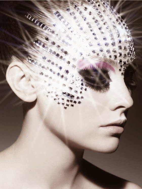
MORE OF RANKIN'S WORK


Wednesday, 4 February 2015
The Adventures of the Foil Tambourines
In this Photoshoot we experimented with light and tinted foil to create patterns shadows and reflections that could fall under the idea of fantastic and strange. Here are some of the photos we took, unedited:
 This photo is good for showing the lighting and different colours that the foils produced. It's interesting because the yellow lighting has lit the blonde hair to be bright and almost tinted green to compliment the crown, but the red lighting has created a fitting background and enhanced the darkness of the brunette hair. Unfortunately the composition is not so good as both subjects have been cut out.
 The composition on this image is better than the previous one but the lighting is less impactful. An interesting vignette effect has been created by the circular shape of the lamp shade. The lighting itself has created a lot of shadows which could be made stronger using photoshop by tools like the burn tool.
 This photo is not as focused and crisp as I would have liked but I do like the composition. It fits the rule of thirds as the head is in one of the focus points. The shadow in the background makes the picture more interesting and the lighting seem more drastic, almost like a warm sunset light which is contrasted by the blue tie and green crown. Again with this shot and a few of the others a nice, natural vignette edge has been created which rather than making the image look tacky, enhances the whites and shapes of the subject.
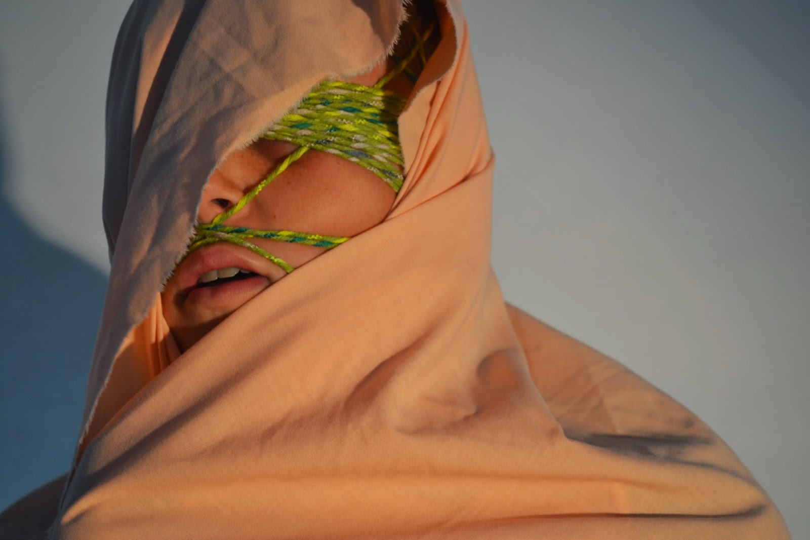 This photo is quite strange, I think that it would probably look better in black and white because the content of the photo appears to reflect on suffering and I think the colours distract from the shadows and contours of the material and face.
 We used these circular foil tambourines to create cool shadows. The colours turned out really vivid and strong. The composition was hard to get right because we didn't want the person holding the camera's shadow to be an intrusion of the shot.
 This picture is a lot more successful than the previous, in mu opinion. The shadows almost look like graffiti stemming from marks on the gravel. The composition is better and fits the rule of thirds. I'm going to open it up on photoshop and whiten the whites and darken the blacks so it's a stronger image as a whole. I may experiment with the liquify tool on this one swell because I think it has the potential to be something ,pre abstract.
 This image and the one below really show the change in colour these foil tambourines create. This one is more successful than the one below because it is more focused on the subject rather than the foil or reflections. The composition is a little out, I think it'd be a much better shot if it was dead centre, then I could create an illusion of a long perspective as if the tambourine was a tunnel/
 This one isn't so good because the focus is on the light reflected on the foil rather than the face. It'd be interesting to take it into photoshop to see if anything could be made from it but without editing it's a little useless.

This picture looks quite inhuman, like something from a film, it's quite strange but again I feel as though the colours detract from any possible meaning. I'm going to make it black and white so that you can really focus on the content.
Edited shots:

Edited shots:
Wednesday, 28 January 2015

Tuesday, 27 January 2015


Subscribe to:
Posts (Atom)