In this Photoshoot we experimented with light and tinted foil to create patterns shadows and reflections that could fall under the idea of fantastic and strange. Here are some of the photos we took, unedited:
This photo is good for showing the lighting and different colours that the foils produced. It's interesting because the yellow lighting has lit the blonde hair to be bright and almost tinted green to compliment the crown, but the red lighting has created a fitting background and enhanced the darkness of the brunette hair. Unfortunately the composition is not so good as both subjects have been cut out.
The composition on this image is better than the previous one but the lighting is less impactful. An interesting vignette effect has been created by the circular shape of the lamp shade. The lighting itself has created a lot of shadows which could be made stronger using photoshop by tools like the burn tool.
This photo is not as focused and crisp as I would have liked but I do like the composition. It fits the rule of thirds as the head is in one of the focus points. The shadow in the background makes the picture more interesting and the lighting seem more drastic, almost like a warm sunset light which is contrasted by the blue tie and green crown. Again with this shot and a few of the others a nice, natural vignette edge has been created which rather than making the image look tacky, enhances the whites and shapes of the subject.
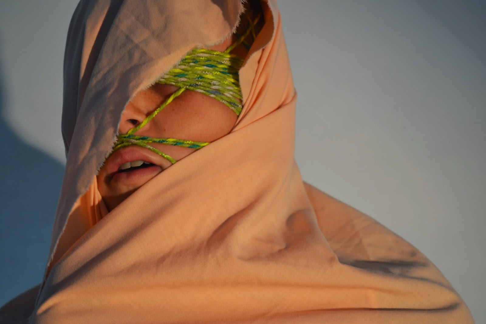
This photo is quite strange, I think that it would probably look better in black and white because the content of the photo appears to reflect on suffering and I think the colours distract from the shadows and contours of the material and face.
We used these circular foil tambourines to create cool shadows. The colours turned out really vivid and strong. The composition was hard to get right because we didn't want the person holding the camera's shadow to be an intrusion of the shot.
This picture is a lot more successful than the previous, in mu opinion. The shadows almost look like graffiti stemming from marks on the gravel. The composition is better and fits the rule of thirds. I'm going to open it up on photoshop and whiten the whites and darken the blacks so it's a stronger image as a whole. I may experiment with the liquify tool on this one swell because I think it has the potential to be something ,pre abstract.
This image and the one below really show the change in colour these foil tambourines create. This one is more successful than the one below because it is more focused on the subject rather than the foil or reflections. The composition is a little out, I think it'd be a much better shot if it was dead centre, then I could create an illusion of a long perspective as if the tambourine was a tunnel/
This one isn't so good because the focus is on the light reflected on the foil rather than the face. It'd be interesting to take it into photoshop to see if anything could be made from it but without editing it's a little useless.


No comments:
Post a Comment