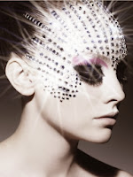
The photo itself is quite compelling in a way. I think that this feeling comes from not only the subject but also the composition and lighting. The subject has been positioned slap bang in the centre which in still life or landscape photography could be considered a flaw, but in portraiture like this it can really help make an impact. The image is very distinct, the stark white lighting makes every feature of the photo stand out making it even stronger.
~~~~~~~~~~~~~~~~~~~~~~~~~~~~~~~~~~~~~~~~~~~~~~~~~~~~~~~~~~~~~~~~~~~~~~~~
 The black background in this photograph helps accentuate the dark eyes and create contrast with the surroundings. The make up has been done in an almost butterfly way. Butterflies are considered to be feminine and beautiful creatures, the droopy eyes and lazy tongue give an almost drowzy facial expression which sort of contrasts with the butterfly idea. I don't like this photo as much as the previous one. Despite the beautiful make up, I can't seem to come to terms with the facial expression. Despite my opinion, of course it has good qualities like every photo. The colours are bright and blend smoothly, not to mention the use of the black make-up which contrasts well with the white palour of the skin and other make-up. Rule of thirds have been used but not as they would be in landscaped and other denominations of photography. The subjects face is both oddly symmetrical but also not complimented by the lopsided shoulders and mouth.
~~~~~~~~~~~~~~~~~~~~~~~~~~~~~~~~~~~~~~~~~~~~~~~~~~~~~~~~~~~~~~~~~~~~~~~~
 This photo is both bright and dark at the same time. The skin almost blends into the pure white background which illuminates the darkness of the eyes and the pink strands. This make-up creates a brilliant colour contrast as well as an interesting photograph. Not much of a story is visible here and as with all art everything can be interpreted in it's own way, differently. It's very abstract and almost like the pink strands are reaching out at you. I don't dislike this photo, it's very interesting to look at and stands out.
 ~~~~~~~~~~~~~~~~~~~~~~~~~~~~~~~~~~~~~~~~~~~~~~~~~~~~~~~~~~~~~~~~~~~~~~~~
 This photo is very beautiful in a strangely natural way. The way that the subjects face has been made-up with calming colours which almost appear to be airbrushed as they all blend together so well. The flower which runs from here eye down to her neck really ties in well with the wind effect which has blown her hair in such a way that appears that she is in touch with nature without it overpowering her. Rankin has done a great job on focusing on focusing the camera as the hair and face all appear in perfect focus despite the fact that each tendril is actually caught in motion. Rule of thirds has been used here both on the actual photo but also on the subjects face.This double use of R.O.T brings the viewers eye straight to that of the subject which is in perfect focus. The black background in the background really brings the subject out. A plain background seems to be a common occurrence in portraiture, probably because it doesn't distract from the subject.
~~~~~~~~~~~~~~~~~~~~~~~~~~~~~~~~~~~~~~~~~~~~~~~~~~~~~~~~~~~~~~~~~~~~~~~~
MORE OF RANKIN'S WORK


No comments:
Post a Comment