Thursday, 12 March 2015

Hidden Identity

The idea of 'Hidden Identity' photography is to almost disguise the face and has some fantastic and strange connotations and effects. It can be as subtle or obvious as wanted, a light coat of paint to an eye peeking from behind a magazine, but different photographers have different reasons for doing this. It could be because they do not like who they are and want to hide not just their appearance but metaphorically shield their emotions, memories and personalities or it can simply be to take a good picture.
Here are some examples of Hidden Identity portraits...


Here are some of my own hidden identity photos taken with +Daniel Burgess 

I think that this picture is pretty cool, it's quite sinister and creepy looking due to the darkened surroundings and blacked out eyes. I did this using the burn tool because it does blacken areas but it also lets the colours blend together unlike the paint tool. As for most of the photos, I seriously upped the clarity which just makes it all seem a lot more hollow.

Before this photo was edited it looked pretty plain; the colours were meak and it was just a picture that you would sort of look at once and move on. However what is cool is the way that the wind is blowing the subjects hair yet it remains in focus. I think that the effect of the wind and the darkened background and lower vibrance makes the whole picture seem a lot more interesting than before. The way that the colours have been darkened almost to a black and white stage yet the colour of the lips and browns of the hair still stand out which is is interesting.


Despite this photo being seriously over-exposed, I actually like is and think the bright colours work. The colours on the face look quite subtle and compliment the blue of the sky. Even though it's really bright, the vibrance has been lowered so that the colours are actually kind of dark which is an interesting contrast. The dark shadows help to set the obvious difference between the extreme whites and make the photo seem a lot more intentional.

This photo's clarity has been taken right up which helps to emphasize each individual crease in the lips and give a definite contrast between the colors. The white pallor of the skin also brings out the lips and helps not to distract from them which is important. I like the amount of detail visible with such a sharp focus.

This image is really strange, I've edited the eye so it looks a lot bigger than the other and because of the shape of the eyebrow and other eye- it kind of works. I've put a filter on it to make it look a bit like a painting and that makes it seem a bit more abstract. I'd like to up the clarity though.

This photo and the one above are the same but further on in the editing process. I got the idea of using the dodge tool on the eyes from Daniel and I think it  was an extremely effective idea as it really gives your eyes somewhere to focus on. Instead of looking vaguely around the picture you look straight to the piercing eyes before examining the rest of the photo. I think that the colours (enhanced on PS) really compliment each other and stand out because of the B&W background.

Wednesday, 11 March 2015

Cultural Reference page- Colour & Films

Colour is fantastic and strange, colour is everything. It can tell us so much but at the same time the way colours melt and grow into one another can be seen as strange. As well as this, it's weird how we can judge so much just by looking at a colour (this is a very strong point in racism, but that's not what I'm going to be looking into)
Colour is an important part of everyday life, everywhere you look there's colour of some sort. People working in industry use it to their example, whether it be in film making, television, or a different art form, it has the ability to alter the mood of something entirely.
Colour is a very useful thing in posters and things for films, it can often tell us what to expect, the genre, content and feeling of the film can be judged right off the bat, it may not always be accurate but if used correctly it's a very effective tool.
In a lot of older action films, we can see a very fiery palette. This can reflect the heat of the fighting or often the settings of the film as they're often set in the hot south or areas of Africa and Asia.

 Here are two examples where yellows, reds and oranges have been used effectively and convey something about what their respective films are going to be like. They also use the merging of multiple images in a lot of these film covers which nowadays is a little tacky if not done correctly.
 I think that these two images show similarities to the type seen in old action film posters, especially because of the colours and double exposure.


Compared to action films, drama and psychological films tend to have a much colder palate, blues and greens as well as a sometimes faded feel to them. This gives a very bare feeling, very scientific, like deep inside someone's head.

 My version was done with brown eyes and bad lighting, I'd like to try re-recreating the Requiem For A Dream poster with a blue iris.


Thursday, 5 March 2015

Brusho


Brusho is a form of powder paint that when put in water disperses to create cool patterns. You can paint the powder with water to create regular paint but after experimenting we found that it looked better when the powder paint was put into water.


This technique is really groovy and has an Aliza Razzel feel to it. It would be interesting to take them into photoshop and have these colours coming out of their heads like an explosion of the brain or something.

Wednesday, 4 March 2015

Experimenting with Photoshop (photoshoot)

This photo is just black and white, it's not very interesting but I like the lighting and shadows. I don't like how the focus is on the nose, it would look better if it was on the eye I think.
To create this image I took two photos and put them on separate layers. I set the top layer's blending type to difference which meant that in the areas where the photo overlapped, an inverted effect happened. The photo could show what's in a person and what they show like the genotype and phenotype of a human but sometimes they overlap and you see things you've not seen before.
I used the same double exposure effect on this photo except rather than choosing the difference blending mode I chose soft light. This created an effect that was similar to some of Edward&Me's photos. The double exposed faces are a lot fainter than the last photo, this makes it a lot more secretive, as if the two faces are what's really within the person but the person is trying to tame it. The black and white makes it quite melancholic, the emotive aspect is clearer in this one than the previous one because there's no colour to distract from the emotion.
With this photo I was just trying out new adjustments that I hadn't looked at before. Here I've applied a posterise effect which brought out some of the contours in the ace.
This photo hasn't actually been manipulated, just converted to black and white. The subject's face is all squashed and dented due to the velocity, they spun their head fast enough to pull the skin and create this effect.
This is an even subtler double exposure photo, it looks as if the other face has just been caught at a more define point. Really I just did the same thing I did with the three heads but with two heads further in motion.
I think this photo is quite representative of body disassociation, as if you're looking at yourself as a stranger but getting lost and confused. Not really very fantastic but quite strange.
I used the liquify tool in this one to pull the face down. It's my least favourite of the photos, I don't really like it at all but it just shows experimentation.
Here I've lowered the vibrance, saturation, and warmth .
The undersides of tongues have a really cool colour palate, the reds and blues I've made even more vivid by increasing the vibrance and saturation. To deepen the lines I've increased the clarity.
To make this photo I just reduced the blue and green channels to 0 which made it only red and black. It looks quite creepy, like something from an independent film poster. I like using a block colour with black because it creates a really bolding effect.

Saturday, 28 February 2015

Wes Naman

Wes Naman's photographs are incredibly different to the norm and I like them a lot. These examples of his work are abstract and very interesting to look at. The different techniques of using string and sellotape create clever and unique distortions on the face. Wes' photographs are more than average and despite the lack of obvious meaning they still contain humour and good photographic techniques such as the rule of thirds. There is a plain, neutral background which helps not to distract from the crazy in the foreground. These are the kind of photographs that really catch your eye and make you look twice just to see what's really going on.
In the image with the tape, it's crazy how with all that's going on with his face, your eyes are still drawn immediately to his eye because it is just so focused and intense.

Thursday, 26 February 2015

Annette Messager

 Annette Messager involves a lot of different materials into her work. In this series, she takes photos of hands, feet, and other body parts and then edits drawings of scenery and little doodles onto the body parts. The base pictures here are in black and white and have a high contrast, the whites are very white and the blacks very black. In these two photos, the hands and feel look as if they're being pressed against glass or  something. I think this effect could be achieved using a photocopier and pressing against the glass.


In one of the hands photos, the drawings are done in colour which contrasts with the black and white background image.

My favourite images of hers are probably the ear ones she does. She draws in all of the contours of the ears (post production) and it creates a really fantastic (but strange) effect, like the ear is some Elven tree house and each level of the ear is a pathway. The colours she uses are bright but not obscene, they're like watercolours and in some of her photos (hands and feet), the paint has a dripping effect.

I find these photos really interesting, the drawings almost allow us to see what's going on inside Messager's head and from that it's like breaking a barrier between what's real and what isn't. As well as the drawings and concepts, I love the clarity of the photos, the lines are strong and the shadows are heavy and sobering, they help finish these impactful photographs.

Recreations:
Without editing-


Sunday, 22 February 2015

PAOLLA RAHMEIER BY JACQUES DEQUEKER // Photoshop Experimenting


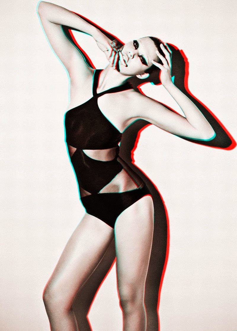
Jacques Dequeker is a Brazilian fashion photographer, with work published in magazines including Vogue Brazil, Vogue Portugal, Marie Claire France, Glamour Paris and more. I wouldn't denote his work as a whole as fitting under the topic 'Fantastic and Strange' but I've decided to look into one of his Marie Claire shoots to seek inspiration which could be applied to fit the topic.

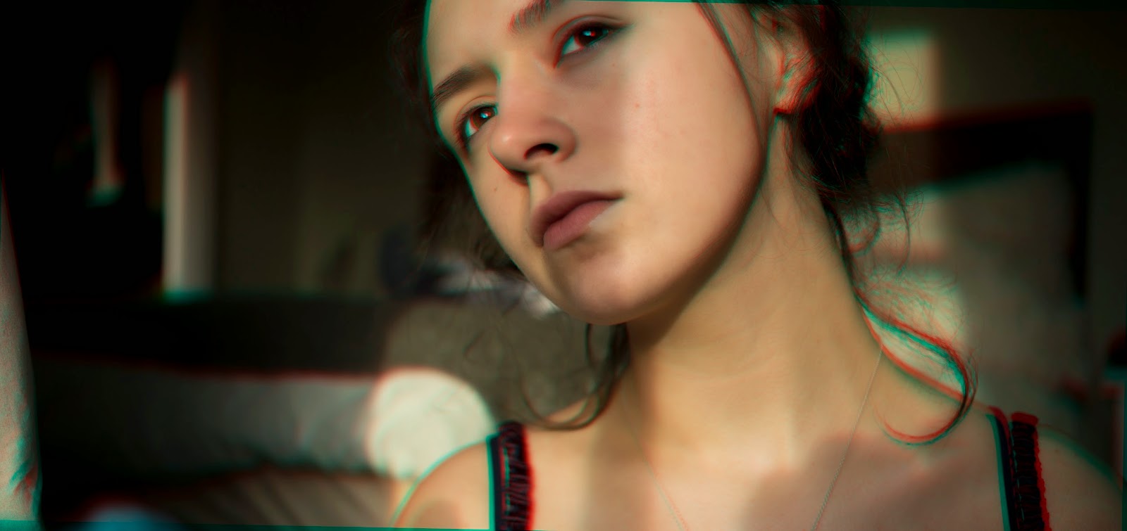
This shoot features prominent elements of 3D futurism, which is a really interesting topic to me. I love the way that the aesthetic of these pictures, despite being quite futuristic, have an 80s/90s retro, VHS edge to them. It's quite a juxtaposition of ideas. The way the colour channels have been manipulated to create this image creates a really interesting vibe. The original colour in the photos comes second to the green and red shadows and highlights.


I've decided to experiment on Photoshop with the Edward&Me photo recreations I did. I've decided to use those because they are really weird and fit well under the title 'Fantastic and Strange', I'm going to use the 3D effect to amplify the strangeness of the photos rather than create the strangeness from a seemingly blank canvas.

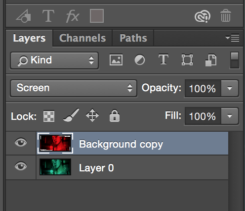
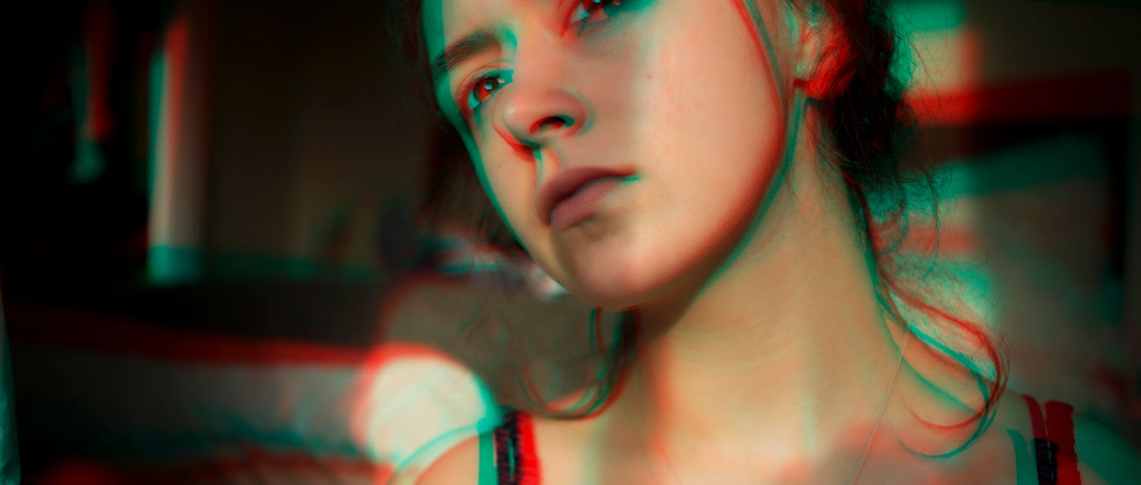
I first edited this photo which hadn't been too drastically manipulated. I upped the warmth and a couple of other factors like the highlights and lowered the shadows to create the base image. Then I duplicated the layer, went to edit/adjustments/colour channel mixer. With red as the selected output, I lowered the red to 0 and pressed accept. I then selected the top layer and did the same thing but this time lowering the green on the green output and the blue of the blue output, both to 0. After that, with the top layer selected I pressed cmd+t to enter free transform mode and rotated the top layer by 1.1 degrees (I experimented a bit with the rotation first to see what I liked best). Finally, I set the top layer's blending mode to screen where the bright cyan and red of the two layers seemed to have an equalising effect on one another, leaving the red and green edges and highlights to create a more subtle 3D effect.


<An example showing more of a rotation between the top and bottom layers, this creates an example more similar to the work of Dequeker.


With these images, I decided to make them all black and white so that they'd all match well with each other and create a series of sorts. I decided to go with the more subtle of the 3D effects but if I had more time I would have liked to experiment more with a stronger rotation.