Here are some examples of Hidden Identity portraits...
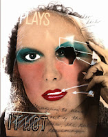
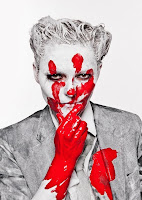
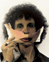
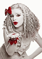
Here are some of my own hidden identity photos taken with +Daniel Burgess
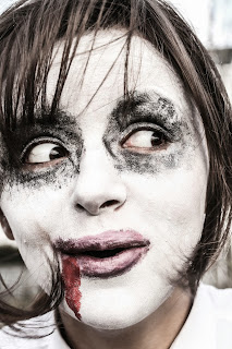
I think that this picture is pretty cool, it's quite sinister and creepy looking due to the darkened surroundings and blacked out eyes. I did this using the burn tool because it does blacken areas but it also lets the colours blend together unlike the paint tool. As for most of the photos, I seriously upped the clarity which just makes it all seem a lot more hollow.
Before this photo was edited it looked pretty plain; the colours were meak and it was just a picture that you would sort of look at once and move on. However what is cool is the way that the wind is blowing the subjects hair yet it remains in focus. I think that the effect of the wind and the darkened background and lower vibrance makes the whole picture seem a lot more interesting than before. The way that the colours have been darkened almost to a black and white stage yet the colour of the lips and browns of the hair still stand out which is is interesting.
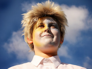
Despite this photo being seriously over-exposed, I actually like is and think the bright colours work. The colours on the face look quite subtle and compliment the blue of the sky. Even though it's really bright, the vibrance has been lowered so that the colours are actually kind of dark which is an interesting contrast. The dark shadows help to set the obvious difference between the extreme whites and make the photo seem a lot more intentional.
This photo's clarity has been taken right up which helps to emphasize each individual crease in the lips and give a definite contrast between the colors. The white pallor of the skin also brings out the lips and helps not to distract from them which is important. I like the amount of detail visible with such a sharp focus.
This image is really strange, I've edited the eye so it looks a lot bigger than the other and because of the shape of the eyebrow and other eye- it kind of works. I've put a filter on it to make it look a bit like a painting and that makes it seem a bit more abstract. I'd like to up the clarity though.
This photo and the one above are the same but further on in the editing process. I got the idea of using the dodge tool on the eyes from Daniel and I think it was an extremely effective idea as it really gives your eyes somewhere to focus on. Instead of looking vaguely around the picture you look straight to the piercing eyes before examining the rest of the photo. I think that the colours (enhanced on PS) really compliment each other and stand out because of the B&W background.


No comments:
Post a Comment