Wes Naman's photographs are incredibly different to the norm and I like them a lot. These examples of his work are abstract and very interesting to look at. The different techniques of using string and sellotape create clever and unique distortions on the face. Wes' photographs are more than average and despite the lack of obvious meaning they still contain humour and good photographic techniques such as the rule of thirds. There is a plain, neutral background which helps not to distract from the crazy in the foreground. These are the kind of photographs that really catch your eye and make you look twice just to see what's really going on.
In the image with the tape, it's crazy how with all that's going on with his face, your eyes are still drawn immediately to his eye because it is just so focused and intense.
Saturday, 28 February 2015
Thursday, 26 February 2015
Annette Messager
Annette Messager involves a lot of different materials into her work. In this series, she takes photos of hands, feet, and other body parts and then edits drawings of scenery and little doodles onto the body parts. The base pictures here are in black and white and have a high contrast, the whites are very white and the blacks very black. In these two photos, the hands and feel look as if they're being pressed against glass or something. I think this effect could be achieved using a photocopier and pressing against the glass.

 In one of the hands photos, the drawings are done in colour which contrasts with the black and white background image.
My favourite images of hers are probably the ear ones she does. She draws in all of the contours of the ears (post production) and it creates a really fantastic (but strange) effect, like the ear is some Elven tree house and each level of the ear is a pathway. The colours she uses are bright but not obscene, they're like watercolours and in some of her photos (hands and feet), the paint has a dripping effect.
I find these photos really interesting, the drawings almost allow us to see what's going on inside Messager's head and from that it's like breaking a barrier between what's real and what isn't. As well as the drawings and concepts, I love the clarity of the photos, the lines are strong and the shadows are heavy and sobering, they help finish these impactful photographs.
Recreations:
Without editing-

Sunday, 22 February 2015
PAOLLA RAHMEIER BY JACQUES DEQUEKER // Photoshop Experimenting
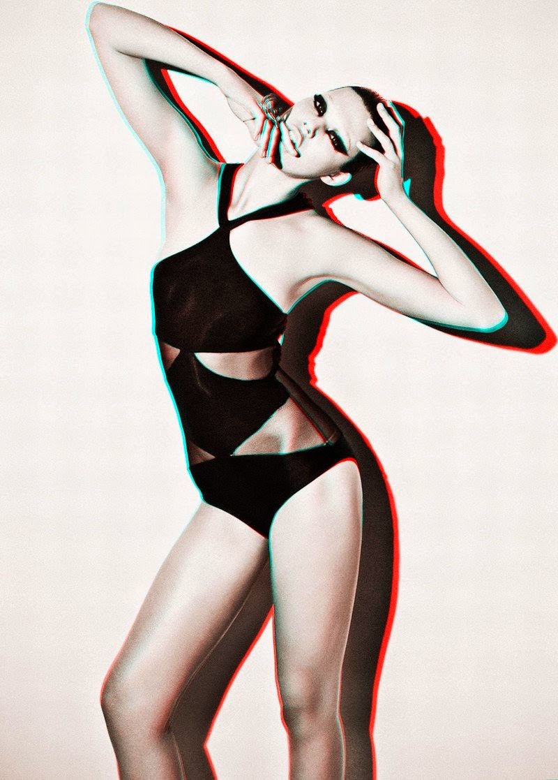
This shoot features prominent elements of 3D futurism, which is a really interesting topic to me. I love the way that the aesthetic of these pictures, despite being quite futuristic, have an 80s/90s retro, VHS edge to them. It's quite a juxtaposition of ideas. The way the colour channels have been manipulated to create this image creates a really interesting vibe. The original colour in the photos comes second to the green and red shadows and highlights.
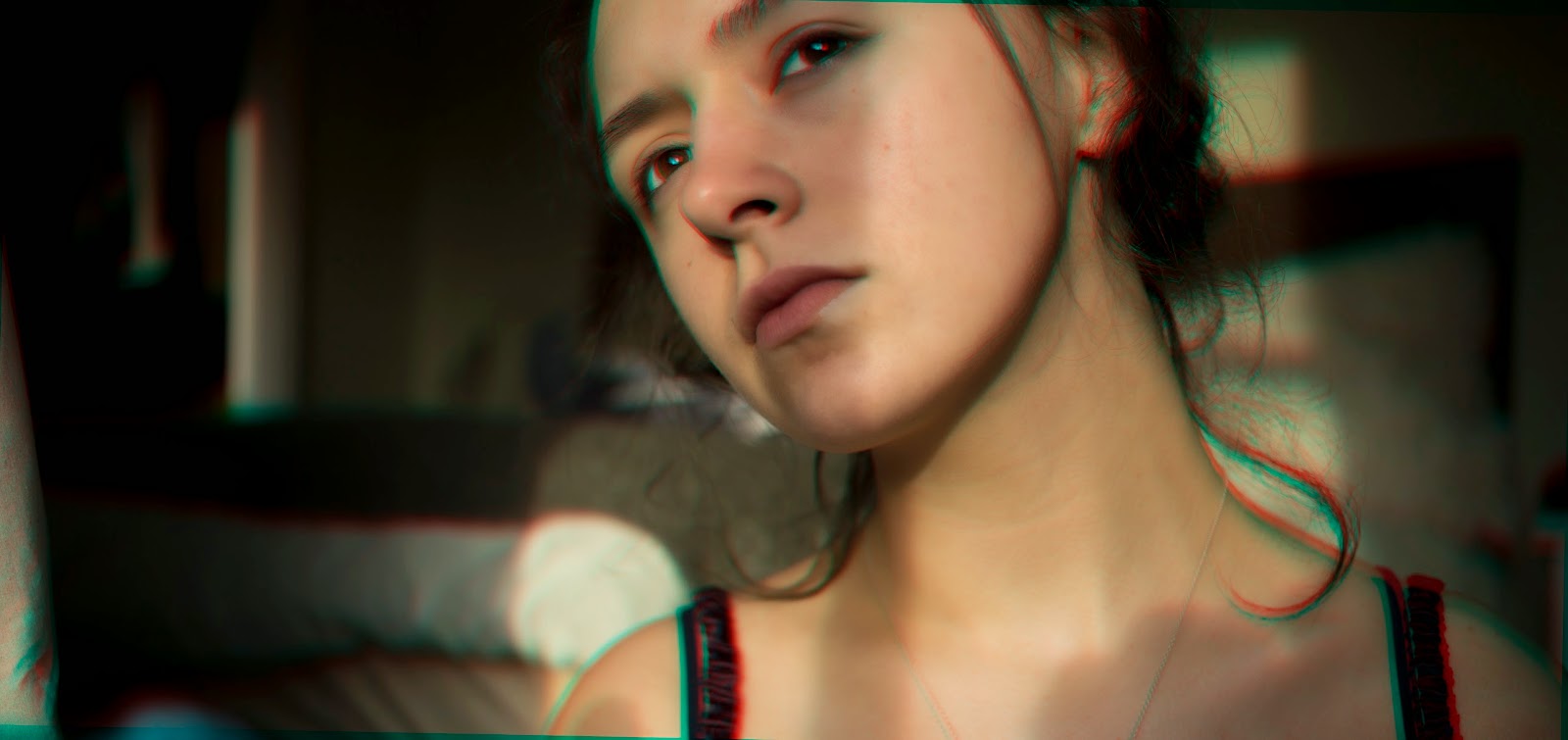
I've decided to experiment on Photoshop with the Edward&Me photo recreations I did. I've decided to use those because they are really weird and fit well under the title 'Fantastic and Strange', I'm going to use the 3D effect to amplify the strangeness of the photos rather than create the strangeness from a seemingly blank canvas.
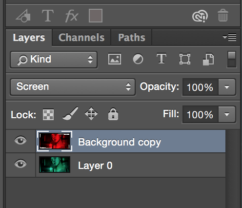 I first edited this photo which hadn't been too drastically manipulated. I upped the warmth and a couple of other factors like the highlights and lowered the shadows to create the base image. Then I duplicated the layer, went to edit/adjustments/colour channel mixer. With red as the selected output, I lowered the red to 0 and pressed accept. I then selected the top layer and did the same thing but this time lowering the green on the green output and the blue of the blue output, both to 0. After that, with the top layer selected I pressed cmd+t to enter free transform mode and rotated the top layer by 1.1 degrees (I experimented a bit with the rotation first to see what I liked best). Finally, I set the top layer's blending mode to screen where the bright cyan and red of the two layers seemed to have an equalising effect on one another, leaving the red and green edges and highlights to create a more subtle 3D effect.
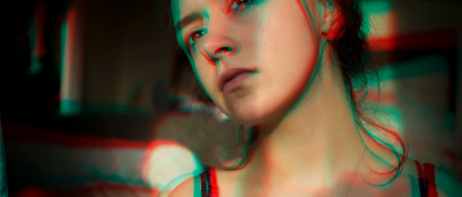
<An example showing more of a rotation between the top and bottom layers, this creates an example more similar to the work of Dequeker.
With these images, I decided to make them all black and white so that they'd all match well with each other and create a series of sorts. I decided to go with the more subtle of the 3D effects but if I had more time I would have liked to experiment more with a stronger rotation.


Friday, 13 February 2015
Photocopier shoot
Photocopier shoot
The use of the photocopier distorts the face to create a strange effect, but the fantastic thing about it is the lighting. The quality and focus of the photos are perfect due to the lighting offered inside the scanner create a great depth of field as well as the pressing against the glass creating a really surreal effect.
I edited this one and lowered the black point so that it looked grimy and gave an almost western old time feel to it. The facial features are almost comical but create a torture-esque feel which is really cool.
I like the above on best because it creates a sort of caricature of the people in the photographs. I like the lighting and framing of the photos and how the pressed areas are so bright in comparison to the darkness of the eyes.
Light experiment
To take these photos we used little coloured glowsticks and put the camera on a long exposure so that you could see the channels of light created by movement.
Thursday, 12 February 2015
Anthropomorphism // Metamorphosis // Me&Edward // Recreations
NOUN ( plural metamorphoses /-siːz/)
1(In an insect or amphibian) the process of transformation from an immature form to an adult form in two or more distinct stages:
A change of the form or nature of a thing or person into a completely different one
Metamorphosis is a concept about the unlimited transformations of human body. Just like a chameleon, it’s fitting, just like a virus, it’s mutating, just like a personality, it’s changing. Something new is about to birth, a metamorphosis, an organic complexity. - Me and Edward
Me&Edward is a French photographer, he works on impulse, finding himself more pleased with his spontaneous work rather than planned projects. I'm going to be researching metamorphosis and he's done a series on the topic which is really useful. The concept of metamorphosis is a really strange one, on one hand it can be seen as purely biological or scientific, but it could also be taken as a metaphor. The Metamorphosis is a book written by Franz Kafka which focuses on a salesman who has been transformed, or metomorphasised, into a large, monstrous, insect-like creature. Although this is a literal take on metamorphosis, it links well to Me&Edward's work as well as showing how people react to change and the unusual
'A snapshot is like a frozen sample of people’s existence and of their emotions, and that is fascinating to me. Once it’s there, still, it’s easier to analyse '- This quote is from Edward&Me's website and explains quite clearly some of the reasons he photographs. I feel I can relate to what he's saying here, an original photo freezes a person as they were at the time. His photo's are quite clearly edited in some of his series' but others have been altered solely to bring out the emotions of the person in the photograph. The way he edits and manipulates his photos never seem to be irrelevant or pointless, it always compliments the subject of the photo. I think that Edward&Me is very diligent on finding separation between object and emotion, even within a person, and this is evident in his pseudonym 'Edward&Me', which he took to disassociate the part of him that's a photographer from the part of him which is a sensitive human being.
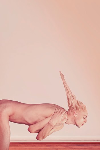
In this photo, a catlike tail has been edited onto the area of the tail bone of the human. This is where the metamorphosis almost breaches anthropomorphism. As with all of the photos in this series, they have a nude colour palate. There's a clear inclusion of pinks and the lighting highlight the shadows beneath the contours of the skin and bones. Despite this, it's quite neutral and the photo is neither too rich in blues nor yellows, without both warmth but not too cold. I like how abstract this picture is and when pared with the fact the body is floating it looks more like an entity than a person.
This picture is really cool because unlike a lot of abstract, conceptualism, it doesn't look over done or fake. Edward&Me has a diploma in 2D&3D graphic design which is probably how he created the spikes but I would have no idea how to recreate this photo with such crispness. The spikes look like part of the body itself and the transition between what's there and what isn't is seamless.
This photo is quite simple really, all that's been changed as far as I can see is the elongation of the neck. If you were to remove the manipulation of the neck I think it would still be a really nice picture due to the lighting and colours. The shadows and ways the body has been lit make it appear almost as if it resembles marble, the contours and dips of the body share a likeness with that of Michelangelo's David.
I really like the positioning and staging of this photo. The way it adheres to the rule of thirds well as how the light behind him is minutely lighter than each layer and the further from the body, the darker it gets. This creates a very sinister effect, Despite how inhuman the face is, the body is quite grounding and almost gives of a reflection of what a person is, and how they choose to portray them-self.


This picture is really awesome. My favourite thing about this series is definitely the lighting and the impact it has on the body and the mood go the photos. The subject of the photo has the perfect body for the conditions of the photograph due to the definition of him. Not just in muscles but also ribs, bones and dents and dips on the neck and chin and tendons etc. I love the positioning of the body in this one, it creates something really sharp. The heart could be recreated by taking a photo of a heart (probably a pigs heart) and photoshopping it in. Or, it could be created by stitching in the heart and including mixed media.
The ribs and abdominal muscles in this photo are heavily shadowed and yet don't look like they should fall into the 'horror' category, which is really interesting. The fact that there are four bellybuttons is kind of gross but would be easy to recreate and makes the subject more inhuman.
Recreations:
I decided rather that mimicking Me&Edward's work exactly, I'd just take the concept and try to apply it to my work. The pulling and elongating of features, unexplainable body proportions and elements- that kind of stuff.
The surreal body manipulation was a really prominent feature in Me&Edward's work. Where he focused a lot more on the body, I decided to focus more on the face, following a similar set of boundaries.
To create these eye pulling images, I took a selection of photos, one where no eyes were being pulled and then two more with me pulling each eye. Then I used the clone tool to clone the pulled eyes onto the normal face which kept the appearance of the sagging eyes but by removing the hands, the eyes are seemingly pulled by their own means.After creating each image I played around a but further, testing to see if they would look better warmer, colder, grittier, monochrome, etc.

 <This image is very vibrant so I translated that idea into the below images. These two photos aren't from their Metamorphosis series but I decided to try and use them as inspiration none the less.
<This image features elements from both of the above image. The hand and vibrant colours are paired with a 3D effect (see my next artist research page), but this edict also creates an almost double exposure feel.
< This image takes the double exposure idea more literally than Edward&Me's example. Whereas his work seems to depict a soul or something leaving the body, the idea of sky's and country grooves are like the soul within the body, being brought out through double exposure.
Subscribe to:
Comments (Atom)


